Time : 12.44AM
Listening to : My own typing?
Where : Room - Mentari Court
I'm visited some corporate websites but most of them were mainly food/beverages producers. The reason is because I'm going to work on Dominos website (M'sia).
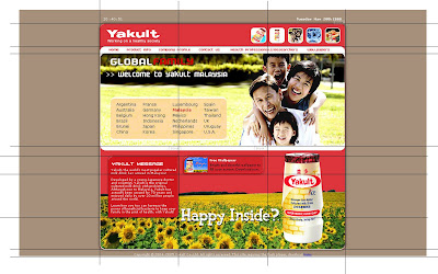
The first one that I'm going to review will be Yakult (Malaysia). Yakult is a company that produces cultured milk drink. Originally founded by a Japanese scientist, Malaysia came up with an improved Yakult: Yakult Ace. This site is to promote this product.
Navigation is very simple. It's top menu. Easy to access and the title used for each segment gives a clear hint of what I should expect when I enter the page. Sub navigation would be side navigation on the left. This sub-navigation is only available when there's more links inside a particular segment. There is one more individual button for direct jump to the wallpaper page at the lower half of the page which I find it quite redundant since the site structure is not that complicated. And it is repeated in each page including the wallpaper page itself. Another annoying point is that there are some "buttons-like" icon that I thought could be clicked at first glance but it was proven not to be functioned that way. i.e. the 5 rounded cornered pictures at the top right hand corner. Also, at the lower half of the page, there's a red box entitled Yakult Message with description. When the mouse cursor rolled over the box, a hand icon will appear which made me feel like it's clickable but again, it was just a false alarm. It does not do anything when clicked. So I think the navigation could be improved in terms of what could be clicked or what could not be clicked.
Design wise, I did feel like I'm in Yakult's site. Aside from the fact that the logo is always at the top left hand corner, the usage of Yakult's corporate colors, red and white played a vital part also. And the fact that a yakult bottle standing out at the bottom of the page clearly wouldn't make me miss that. Each sub page actually has the same structure. Side buttons on the left and an iFrame on the right. The iFrame has 2 sets of scrollbar even though the site utilized only the top down scrollbar. So I think they should just lose the unused left right scrollbar because it is very distracting. Not only that, I think the usage of the sunflower field background really clashes with the rest of the design. And it doesn't blend in at all with the bottle. All the elements look pretty separated from each other. Typography wise, I think some of the point size are too small. Quite hard to read. I think it can afford to go bigger than this.
Content within the website itself is very well organized. Very straight-forward and informative. I know what page to go to. The sub categories for each page also help to break the big chunks of information into smaller portion for easy info digestions.
Grid system for this site is basically divided into 2 types. The grid for homepage and also sub-pages as shown at below.
The 2nd website that I am reviewing will be Heinz (Ireland). Heinz is a company that sells food product, mainly ketchups, condiment, sauces and even meals and snacks.
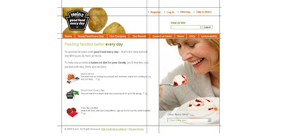
Navigation is very easy. The main navigation is top menu. Links are very well indicated, allowing me to go straight to the segment that I want. Aside from Homepage, the rest of the pages are supported by another set of sub-navigation in the form of side menu. Some of the links at the side menu are also in the form of drop down list to reveal more in-depth information links. At the top right of the page, there's another set of navigation. It's more like a secondary set of links. The main navigation contains links to information while this secondary navigation is registration kind of links.
Design wise, I like the simplicity and clean look of the entire page. There's consistency in all the pages. The Heinz brand logo is always situated on the top left hand of the page. Colors are very well put together, easy for the eyes and doesn't clashed. And images chosen for the banner for each page supported the design of the site also. Typography wise, it is ok except for the main page where the description for some of the sub pages are too small I could hardly read it.
Content in this site are well organized also. Within the content itself, some additional links are provided to lead user to additional info outside of the website itself. The search function is also very useful. It helps me to grab the information that I want without having to go through all the text in the whole section. All information are arranged on the right, just beside the side bar. I like the way they put the main headings in the content but gave the option to read the details by clicking on the link provided instead of having to scroll down through all the details at one shot. What I don't like about the content arrangement is that they do not provide breadcrumbs to allow me to track back what page is the subpage of another. For example if I clicked the baby food from "Our Brand". When I'm in that page, I wouldn't know that the main page is "Our Brand". I think by adding in Breadcrumbs, it will solve this problem.
Grid system for this site is basically divided into 2 types also. The grid for homepage and also sub-pages as shown at below.
The last website I'm going to review will be McDonald's (Australia). For this website, I will be reviewing the Flash site, catered for broadband users and also the supporting HTML site, catered for dial-up users. This what I really like about the website. It is very user friendly and it allows users of any internet speed to access the site without causing them additional waiting time. I think everyone knows what McDonald's is all about. It's one of the most successful fast food chain the whole wide world. To be honest, if one day all the fast food chains has to stop operating except for one, I would have voted for McD. Don't think I can live without my Fillet-O-Fish. Hehe... Anyway....
These are the screen shots for the flash version
And these are the screen shots for the html version.
Navigation for the flash site is very interesting. It reminded me of the Big Pencil website by Leo Burnett. The page icon will float in the middle and is significantly bigger and the colors more saturated compared to the inactive pages. There will be other clickable icons floating around it. When clicked, the page will zoomed into the icon's element and reveal all the information the page. And within the active page itself, there are some pages that have their own set of navigation such as side menu. I.E McDonald's Restaurant page. There is also an additional kind of navigation. The drag and drop navigation in the Nutrition Calculator page (html version does not have this function). User can drag the food that they want and find out what is the nutrition content. "Back" button is provided at the side of the page frame itself to allow users to track back the previous page. There is another set of bottom menu to allow user to access to the html version, track back where they are, contacting the site and terms&conditions links (same as html version except for the tracking back where user is).
For the html version, it's very simple. The main navigation will be in the form of top menu. And as we enter the page, the rest of the links will be provided in the same icons used in the flash version but in the form of side menu on the right. Under the main top menu, inside each subpage, there is another secondary top menu. It serves as the page indicator cum alternative buttons for the sub links in a particular category. Both html and flash version will link user to a new page if Happy Meal link is clicked.
Design wise, both flash and html versions are similar with the use of solid black background and icons. All icons are in a way related to McDonald's either by the color scheme or the elements used. Typography arrangement is very nicely done. The hierarchy is very clear. It's easy to read and the images used to support the content are very well chosen. The colors made the whole site look rather appetizing.
Content in the flash version is arranged within the frame of the elements used in the page itself. If the content is more than what the frame can whole, "next" button is provided to allow user to read more on the particular information. Although the icons seemed scattered, the information is very well organized because the icons that float around the active page are related to the page itself. For the html version, the contents are also well put together. Related links are grouped under a main category. The information is displayed on the left hand side of the page or sometimes it's in download able pdf form.
Grid system for html site is basically the same for every page. The grid for homepage and also sub-pages as shown at below. As for the flash site, it's divided to 2. The bottom navigation and content area.

Yeap. That's all for my analysis. Please feel free to comment.
-chen-
[2.56AM]
Labels: sharing, web analysis, Web Design 2


