Thursday, May 29, 2008
posted by Chen at 8:41 PM
Date : 29th May 2008
Time : 8.41PM
Listening to : Billy Jean - David Cook
Where : Room - MC

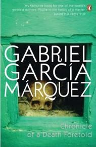
This is my idea for Digital Photography class. I'll base my subject matter on the book by Gabriel Garcia Marquez entitled Chronicle of a Death Foretold.

.......................................................................................................................................
ThePlot (Skip the entire bunch of text if you have no intention to find out)


The narrative outlines the events surrounding the murder of Santiago Nasar, a young man who is thought to have taken the virginity of Angela Vicario. On her wedding night, after discovering that she was not a virgin, Angela's husband, Bayardo San Roman, returns her to her house. Angela's twin brothers, Pedro Vicario and Pablo Vicario, ask her who took her virginity, and she tells them that Santiago Nasar did. The brothers find Santiago and kill him.
The narrative is non-linear. The narrator begins the story by telling us about Santiago Nasar's household the morning he was murdered. In the course of the chapter, we learn that Santiago lived with his mother, Placida Linero; their cook, Victoria Guzman; and her daughter, Divina Flor. Santiago's father, Ibrahim Nasar, has died three years previously. After his father died, Santiago took over the family ranch, which has been very successful; the Nasars are wealthy in their community.

The day that Santiago is murdered was a significant day in town because the Bishop was coming by boat to bless the marriage of Angela Vicario and Bayardo San Roman. Many people were heading over to the dock to see the boats. Pedro and Pablo Vicario were sitting in the local milk-shop, which was en route to the dock, so that they could see Santiago Nasar either going or returning in order to track him down and kill him. The narrator's sister learns that Angela Vicario was returned home on the night of her wedding.

Bayardo San Roman had come to town to find a bride. After deciding on Angela, the courtship was short. Because Bayardo came from a prestigious, wealthy family, and the Vicarios were relatively poor, Angela did not really have a choice, even though she did not love Bayardo at the time they were wed. The night before the murder, there had been lots of wedding revelry that had continued into the early morning at a local whorehouse run by Maria Alejandrina Cervantes, where Santiago Nasar had been carousing with the twins and the narrator until early in the morning. After returning home and finding their sister in disgrace, the Vicario brothers set out to avenge her honor by murdering Santiago Nasar. Even though they repeatedly announced their intent to murder him, the butcher, the police officer, and the Colonel all thought that the Vicarios are largely bluffing. Clothilde Armenta, the proprietor of the milk shop, even told the local priest about what the Vicario twins were threatening to do. However, in the excitement surrounding the arrival of the bishop, he forgot about her warning.

After the murder, the entire Vicario family left town because of the disgrace the combination of events had brought upon their family. A week after the murder, Bayardo San Roman left with his family; they came and retrieved him by boat. The Vicario brothers were imprisoned for three years. After their release from prison, Pablo proceeded to marry his betrothed, Prudencia Cotes, and Pedro went back into the armed forces. After Bayardo returned Angela to her home on their wedding night, she fell in love with him. After she moved away from the town where she was disgraced, she wrote him letters every week for seventeen years, and eventually he returned to her.

For years after the crime, it was all anyone in the town spoke of. The narrator tells how his friend Cristo Bedoya searched frantically for Santiago the morning of the murder in order to warn him of the Vicario brothers' plan, but failed to find Santiago because he did not realize that Santiago had gone to the house of his fiance, Flora Miguel. Her father was the first to warn Santiago of the murder. At this point, there were crowds of people outside who had come to see the Bishop but had lingered because they had heard the rumor that Santiago was to be killed.
When he left Flora Miguel's house, Santiago was very confused. Clothilde Armenta yelled at him to run, and he ran the fifty yards to his front door. Due to miscommunication, Santiago's mother locked the front door just as he approached The Vicario brothers easily caught up with him, and stabbed him to death right outside of Santiago's front door.
......................................................................................................................

That's the plot. So my plan revolves around the idea of making a trailer or preview of this book using series of still photographs. Basically it will give some kind of short summary of the content of the book. I am doing Emotive Photography. I had no intention of model driven theme at the start of the class but somehow I was pretty intrigued by humans body language that could channel emotion without showing facial expression. I am not sure if I will include snippets of facial expression in this project. Most likely not. I am doing model hunting now. I have the visual in my head but it's quite difficult to get the location set up. Well, anyway, although I will be doing a trailer for this book, I am not going to set in a Latin town theme. I am going to make a local version of it. Dang...sound so cheap but hopefully it will work. I mean come on la... Where am I suppose to find Latin girls and Arabian guys la.

::Selective Scenes to shoot in chronological order::

1. The marriage
2. The missing stain of honor (virginity)
3. Return of the bride & beatings
4. Return of the twin brothers
5. Naming of the perpetrator (Santiago Nasar)
6. Santiago Nasar climbed out of bed
7. SN took some aspirins
8. The last talk with his mom
9. Preparation to kill Santiago
10. Whispering of the crowd
11. Spotting of Santiago
12. Chasing Santiago starts
13. Refraining action by bar mistress
14. Santiago running for home
15. Locking Santiago out & cornering
16. The murder
17. The conclusion

Basically that will be the few selected key frames I will be shooting. I did some location scouting a couple of days ago. I have yet to get a proper indoor location but I found some quiet spots behind the new Sunway Pyramid. I probably might use there. And I intended to use the parking rooftop right here in Mentari. I seriously in need of indoor location with proper bed with window. If anyone could offer me their place just for a day or two I will really be grateful.

For models, I managed to persuade James into this and he is fine with the schedule for now. I've gotten David for this shoot also. Zheng will be part of it but I may ask Francisca to be my main female character. I would prefer Zheng to help me in my technical part. I need at least 2 more male models to help me out preferably with similar height and built. Please (I am really pleading), do tell me if you could help me in any of the area at all.

The mood I am going for is probably black and white the depict the solemness of the entire setting.

Well, I guess that's all for now. Will be going down Malacca for location scouting for Digital Video class. And this week, there're at least 80 photographs to be taken for weekly assignment and another 10 or so for trial final project shots.

You tell me, die or not die?

-chen-
[9.39PM]


Labels: ,

 
Wednesday, May 28, 2008
posted by Chen at 11:43 AM
Date : 28th May 2008
Time : 11.44AM
Listening to : Making love out of nothing at all - Bonnie Tyler
Where : Room - MC

My project brief for Web Design 2 is to redesign the website of my client, Domino's. I checked out a few of its' competitor's website. PizzaHut is obviously the biggest competitor and they offer delivery also. The 2nd one is McDonald. I know I did McDonald in my previous corporate analysis but the current one that I did is a Malaysia website. Same goes for PizzaHut. Same thing, I chose McD cos' they offer delivery also. The last one that I did does not offer delivery but it's a fast food chain also. Kentucky Fried Chicken.

PizzaHut (http://pizzahut.com.my)


Target audience that PizzaHut aimed for would be for families and also group of friends. But for Domino's Pizza, most of the combo and offers are for working adults, people who order their meals to be delivered to the office. Probably for working people who does not want to face the hassles of going out and get their meals but prefer to order for delivery.

Type of food that PizzaHut offer ranges from pizzas to even rice. They do not offer only pizzas but also other meals like pastas, rice, and even offer appetizers and deserts. Same goes for Domino's but my client does not offer such wide range of food. Even though they do have pastas and desert, they are all categorized under side orders. It's clear that Domino's place a big emphasis on their pizzas.

Delivery Service offered by PizzaHut is available only in certain outlets but their dine in service is for every single outlet. No guarantee of the time taken to have the orders delivered. But for their take away, a guarantee of 15 minutes is given. Compared to Donino's, of all the outlets in the whole country, every outlet (except for 2) offers delivery & take away. But only the 2 outlets that does not offer delivery has dine-in. Domino's is all about delivery. 30 minutes for delivery, that's their guarantee to their customers.

The Advantages that PizzaHut has is obviously the dine-in availability that they offer. And also they have more outlets compared to Domino's for easier accessibility.

The disadvantages that PizzaHut suffer from would be their delivery offer. Compared to Dominos, PizzaHut cannot give a specific period of time taken to have the orders to be delivered. And not all outlets offer delivery.

The website itself has a good use of corporate colors. But it took some time to load especially the side bar and I have no idea why. And their online order page, if accessed from the blinking icon, it will redirect us to another page via a new tab. But if accessed from "how to order", it will be redirected to the order page without using a new tab. The problem to this is that there is no side menu to access and also no back button also. Aside from the loading problem, I think it's quite sufficient when it comes to the information.

McDonald's (http://www.mcdonalds.com.my)


Target audience that McDonald aimed for is mainly for kids. Their sets like Happy Meal obviously stated so. And all of their menu sets are for individuals, not for big groups of people.

Type of food that McD offers usually cater for individuals. Unlike Domino's, McD does not offer combos or sets that could be shared by more than 2 people. And their menu is limited to only burgers, fries and nuggets for the main products. But they do offer side orders like porridge. And different time of the day, they have different offers and menu sets such as breakfast set.

Delivery Service offered by McDonald will be charged RM3 for delivery and also limited to certain areas only. No minimum order is required. As for Domino's, a minimum order of a regular pizza is required.

The Advantages that McD has would be the no minimum order required. And also, McD is a hit with teens and kids nowadays. And they cater for individual sets.

The disadvantages that McD has would be their delivery services also. Although they offer delivery, the food that are delivered usually do not taste as good as compared to Domino's. I think it's the kind of food that they offer. And Domino's deliver their food within 3 minutes in a hot pouch. But McD, fries and the bread kinda get soggy after that.

The website irritated me. I don't know if it's just my browser or what but the flash for main page just jammed my browser for seconds and I think it's pretty annoying. Other than that, information is quite easy to access. Layout is pretty consistent.

Kentucky Fried Chicken (http://kfc.com.my)


Target audience that KFC is aiming for is families and children. It's quite apparent in their ads and commercials.

Type of food that KFC offer is of course poultry related products for main course. They also offer side orders. KFC is more flexible in their sets and combo because they cater for both individuals and also group of people.

Delivery Service is not available.

The Advantages that KFC has would be their flexibility. Since they cater for both individuals and also group of people and also the accessibility of dining in, people may tend to choose KFC.

The disadvantages suffered by KFC would be the lack of delivery. This means those who want to have KFC, they have to go to the outlet.

The website in terms of navigation is quite confusing. Some links are repeated. And I think the buttons are too scattered. The colors used is quite consistent except for some pages like kids meal and kfc e-cravings for example. The main page and most of the pages will have that rays lines coming out of the logo but some of the pages doesn't. And in some of the pages, the second bar of navigation isn't there anymore. And in terms of colors usage, I find it hard to find a focus point. Too many colors and everything stood out too much.

One point that I noticed when analyzing all these websites and also some of the others, all these fast food chains, they included info on how they are contributing back to the society or environment. And the same goes for Donimo's website. I think it's a kind of publicity in away. Some environment/society conscious customers may choose which fast food chains to go for according to this factor.

All in all, Domino's put great emphasis on their delivery service and also online ordering. Yes, my client's competitors may have more to offer, more dine in options and more outlets compared to my client. But Domino's target audience is very different from the rest of its' competitors. Domino's targeted for working adults, a totally different target audience from the rest. And it's the delivery that drew its' target audience to choose Domino's because of the guarantee offered. And I think Domino's website is a very important media to attract more customers. And currently, Domino's website is not that user-friendly. Some pages are so long and it gets kind of boring to even attract me to scroll down further. Information are not sorted out properly. So it could be quite a task to improve this. :)

Well anyway, please do drop comments on what you think of the websites that I've shared. Any info that I might have missed out or anything like that.

-chen-
[6.31PM]

Labels: , ,

 
Friday, May 23, 2008
posted by Chen at 12:47 AM
Date : 23rd May 2008
Time : 12.49AM
Listening to : Winhill - FF8
Where : Room - MC

Sketched some random stuff during marketing class. I am not saying that it's a boring class ok. Vincent was pretty entertaining. I just had the urge to scribble. Lately, (even in church), I've been drawing random characters... a lil' robotic in a way. Decided to convert it to digital file. The background was crap cos' I became lazy after a while. Ehehehehe.... Might work on it later. Just for fun.


-chen-
[12.53AM]

Labels: ,

 
Wednesday, May 21, 2008
posted by Chen at 12:44 AM
Date : 21st May 2008
Time : 12.44AM
Listening to : My own typing?
Where : Room - Mentari Court

I'm visited some corporate websites but most of them were mainly food/beverages producers. The reason is because I'm going to work on Dominos website (M'sia).

The first one that I'm going to review will be Yakult (Malaysia). Yakult is a company that produces cultured milk drink. Originally founded by a Japanese scientist, Malaysia came up with an improved Yakult: Yakult Ace. This site is to promote this product.

Main Page

Company Profile

Health Professionals/Research

Product Info

Navigation is very simple. It's top menu. Easy to access and the title used for each segment gives a clear hint of what I should expect when I enter the page. Sub navigation would be side navigation on the left. This sub-navigation is only available when there's more links inside a particular segment. There is one more individual button for direct jump to the wallpaper page at the lower half of the page which I find it quite redundant since the site structure is not that complicated. And it is repeated in each page including the wallpaper page itself. Another annoying point is that there are some "buttons-like" icon that I thought could be clicked at first glance but it was proven not to be functioned that way. i.e. the 5 rounded cornered pictures at the top right hand corner. Also, at the lower half of the page, there's a red box entitled Yakult Message with description. When the mouse cursor rolled over the box, a hand icon will appear which made me feel like it's clickable but again, it was just a false alarm. It does not do anything when clicked. So I think the navigation could be improved in terms of what could be clicked or what could not be clicked.

Design wise, I did feel like I'm in Yakult's site. Aside from the fact that the logo is always at the top left hand corner, the usage of Yakult's corporate colors, red and white played a vital part also. And the fact that a yakult bottle standing out at the bottom of the page clearly wouldn't make me miss that. Each sub page actually has the same structure. Side buttons on the left and an iFrame on the right. The iFrame has 2 sets of scrollbar even though the site utilized only the top down scrollbar. So I think they should just lose the unused left right scrollbar because it is very distracting. Not only that, I think the usage of the sunflower field background really clashes with the rest of the design. And it doesn't blend in at all with the bottle. All the elements look pretty separated from each other. Typography wise, I think some of the point size are too small. Quite hard to read. I think it can afford to go bigger than this.

Content within the website itself is very well organized. Very straight-forward and informative. I know what page to go to. The sub categories for each page also help to break the big chunks of information into smaller portion for easy info digestions.

Grid system for this site is basically divided into 2 types. The grid for homepage and also sub-pages as shown at below.

Main Page

Sub Page

The 2nd website that I am reviewing will be Heinz (Ireland). Heinz is a company that sells food product, mainly ketchups, condiment, sauces and even meals and snacks.

Main Page

Baby Food

Good Food Every Day (Sub)

Good Food Every Day (Intro)

Brands & Products

Navigation is very easy. The main navigation is top menu. Links are very well indicated, allowing me to go straight to the segment that I want. Aside from Homepage, the rest of the pages are supported by another set of sub-navigation in the form of side menu. Some of the links at the side menu are also in the form of drop down list to reveal more in-depth information links. At the top right of the page, there's another set of navigation. It's more like a secondary set of links. The main navigation contains links to information while this secondary navigation is registration kind of links.

Design wise, I like the simplicity and clean look of the entire page. There's consistency in all the pages. The Heinz brand logo is always situated on the top left hand of the page. Colors are very well put together, easy for the eyes and doesn't clashed. And images chosen for the banner for each page supported the design of the site also. Typography wise, it is ok except for the main page where the description for some of the sub pages are too small I could hardly read it.

Content in this site are well organized also. Within the content itself, some additional links are provided to lead user to additional info outside of the website itself. The search function is also very useful. It helps me to grab the information that I want without having to go through all the text in the whole section. All information are arranged on the right, just beside the side bar. I like the way they put the main headings in the content but gave the option to read the details by clicking on the link provided instead of having to scroll down through all the details at one shot. What I don't like about the content arrangement is that they do not provide breadcrumbs to allow me to track back what page is the subpage of another. For example if I clicked the baby food from "Our Brand". When I'm in that page, I wouldn't know that the main page is "Our Brand". I think by adding in Breadcrumbs, it will solve this problem.

Grid system for this site is basically divided into 2 types also. The grid for homepage and also sub-pages as shown at below.

Main Page


Sub Page

The last website I'm going to review will be McDonald's (Australia). For this website, I will be reviewing the Flash site, catered for broadband users and also the supporting HTML site, catered for dial-up users. This what I really like about the website. It is very user friendly and it allows users of any internet speed to access the site without causing them additional waiting time. I think everyone knows what McDonald's is all about. It's one of the most successful fast food chain the whole wide world. To be honest, if one day all the fast food chains has to stop operating except for one, I would have voted for McD. Don't think I can live without my Fillet-O-Fish. Hehe... Anyway....

These are the screen shots for the flash version

Main Page

Nutrition Calculator

Our Food

McDonald's Restaurant

Tomatoes

And these are the screen shots for the html version.

Main Page

Main Menu

Our Food

Navigation for the flash site is very interesting. It reminded me of the Big Pencil website by Leo Burnett. The page icon will float in the middle and is significantly bigger and the colors more saturated compared to the inactive pages. There will be other clickable icons floating around it. When clicked, the page will zoomed into the icon's element and reveal all the information the page. And within the active page itself, there are some pages that have their own set of navigation such as side menu. I.E McDonald's Restaurant page. There is also an additional kind of navigation. The drag and drop navigation in the Nutrition Calculator page (html version does not have this function). User can drag the food that they want and find out what is the nutrition content. "Back" button is provided at the side of the page frame itself to allow users to track back the previous page. There is another set of bottom menu to allow user to access to the html version, track back where they are, contacting the site and terms&conditions links (same as html version except for the tracking back where user is).

For the html version, it's very simple. The main navigation will be in the form of top menu. And as we enter the page, the rest of the links will be provided in the same icons used in the flash version but in the form of side menu on the right. Under the main top menu, inside each subpage, there is another secondary top menu. It serves as the page indicator cum alternative buttons for the sub links in a particular category. Both html and flash version will link user to a new page if Happy Meal link is clicked.

Design wise, both flash and html versions are similar with the use of solid black background and icons. All icons are in a way related to McDonald's either by the color scheme or the elements used. Typography arrangement is very nicely done. The hierarchy is very clear. It's easy to read and the images used to support the content are very well chosen. The colors made the whole site look rather appetizing.

Content in the flash version is arranged within the frame of the elements used in the page itself. If the content is more than what the frame can whole, "next" button is provided to allow user to read more on the particular information. Although the icons seemed scattered, the information is very well organized because the icons that float around the active page are related to the page itself. For the html version, the contents are also well put together. Related links are grouped under a main category. The information is displayed on the left hand side of the page or sometimes it's in download able pdf form.

Grid system for html site is basically the same for every page. The grid for homepage and also sub-pages as shown at below. As for the flash site, it's divided to 2. The bottom navigation and content area.


Main Page
Sub Page

Yeap. That's all for my analysis. Please feel free to comment.

-chen-
[2.56AM]

Labels: , ,

 
Tuesday, May 20, 2008
posted by Chen at 12:07 AM
Date : 20th May 2008
Time : 12.07AM
Listening to : My own typing
Where : Room - Malacca

Watched Missing Pages last Friday with classmates. This is part of our Photography assignment. So we divided ourselves into 3 groups. I was grouped up with Tanyus and Selvia. (Easier to communicate since they are my downstairs neighbors) Missing Pages is a 24 minutes movie made entirely out of still photographs. It's technique known as "Fotomation". Produced by Chage. Written and directed by Jerome Oliver. It's really interesting to watch it. So, basically, each team have to select 3 scenes that we like the most and state why. Have to present it in class. So yeah, Tanyus put together the selections into a very nice presentation kit. So all credits should go to her after this for her effort to make it so presentable. :) Thanx short-haired woman!!!

Below are the screenshots that we've selected. Click to enlarge. (Then you can kill your boredom and read why we chose it)

Index Page

Scenes Selection

Scene chosen by me

Scene chosen by Tanyus

Scene chosen by Selvia

So yeap, dats basically all for the sharing. Especially love that roll over effect for the scenes selection. ^^

-chen-
[12.21AM]

Labels: ,

 
Sunday, May 18, 2008
posted by Chen at 10:49 PM
Date : 18th May 2008
Time : 10.49PM
Listening to : From a distance - Bette Miller
Where : Room - Malacca

Changed the skin for now. Bleh. Don't like it still. Only like the character design. Never really like black as the background anyway. Just hope I will find the time to do the layout myself. =.=!

Here's my Scanogram. Some were rearranged using photoshop. Bleh... It's interesting to work this way but I had very lil' time on Thursday. Have to finish it by then cos' I wouldn't be around during the weekend. So got pretty limited scans.


Maybe next time when time allows, I will have more than just this to present. But for now, this will have to do. :) Hope Wei Meng doesn't see this.

*Update*
Hsemate (Zheng) asked what inspired me for this project. Actually really nothing la. I am so random right. I pretty much work with things within my arm-reached. And also in semi-darkness. SO I just grabbed random stuff. But I guess within the period of time working things out, I guess I was driven by facial expression and robots. So yeah. Thanx Zheng for provoking this thought. Dang.... I am so random I might just end up in Jupiter.

-chen-
[11.08PM]

Labels:

 
posted by Chen at 5:15 PM
Date : 18th May 2008
Time : 5.16PM
Listening to : Cartoon Network
Where : Parents' Room - Malacca

Ok... assignment updates.

Digital Photography
Scanogram - 2 sets (4R) : Bring your raw files along
Bring your camera
Presentation on Missing Pages
Those who are purchasing cameras please meet in lobby at 2PM (Tuesday)
Ideas for your final project

Web Design 2
3 website analysis on corporate website (Post it on blog)
Research on the website that you picked and their competitor

Digital Videography
Propose ideas for documentary

Marketing
15 questions for survey
Research on business proposal (I might be wrong... will update asap)

That's all for next week. Another announcement will be, (Although I told everyone already), I am handing over the monitor position to Selvia. So look her up if you need to know anything.

-chen-
[5.23PM]

Labels: ,

 
Wednesday, May 14, 2008
posted by Chen at 4:36 AM
Date : 14th May 2008
Time : 4.37AM
Listening to : Nothing
Where : MC - Room

Finished the website for healing therapy. To be honest, I couldn't really track my time that well. Some disturbances along the way like talking to bro la and all. But I would say approx. 3 hours plus minus. T___T I know... Exceeded the time limit. But seriously this must be the fastest I've worked. I'm just using back the elements in the main page. No time to do new one. Here are the screenshots.

Lavender Therapy Pop-up

GreenTea Therapy Pop-up
Main Page


I know it's not the best but yeah... Broke my own record. Stressnyer~!

-chen-
[4.43AM]

Labels: ,